buu Posted May 9, 2019 Share Posted May 9, 2019 3 hours ago, Xeno said: Our latest GUI update, courtesy @Aesthetic and myself. Damn you guys snapped Pixellife, Kibbelz and Xeno 3 Link to comment Share on other sites More sharing options...
Xeno Posted June 7, 2019 Author Share Posted June 7, 2019 In preparation for our Kickstarter campaign we created this game-play video. The campaign will launch by June 11th. Worldofjimmy, Kibbelz and Recoil 3 Link to comment Share on other sites More sharing options...
Apache_ Posted June 7, 2019 Share Posted June 7, 2019 That was really good. Honestly I think that video (even though its for a kickstarter) is a perfect example of what an Intersect game can be if you put in the work. Make sure I get a PM when the campaign starts so I don't miss it. My one and only complaint is that in my opinion there was a lot of dark combat scenes bunched up around the middle that, again in my opinion, didn't really help to show off how beautiful all of the other visuals in the game are. Its a game about werewolves so I know there is going to be a lot of night combat, and towards the end it looked great. I don't really have any suggestions on improvement tho, maybe adding in some more daytime combat in between? The best part in my opinion, 1:16 where you walked from the forest into the desert, looks amazing. Edit: You know what I watched it again and even though it looks a little dark for my liking in some scenes, all of the lighting and colors look totally amazing and look better in each re-watch. I also forgot to mention how I like that you are getting your ass kicked in every combat. Xeno 1 Link to comment Share on other sites More sharing options...
Kibbelz Posted June 9, 2019 Share Posted June 9, 2019 Latest update as of the last live stream at www.twitch.tv/mageworkstudios I mapped out the first floor of Frost Castle: Spoiler Be sure to follow us to tune in for the next stream! You might learn something cool you can use in your game! Recoil, Pixellife, jcsnider and 1 other 4 Link to comment Share on other sites More sharing options...
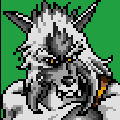
Xeno Posted June 23, 2019 Author Share Posted June 23, 2019 Here's a preview of the upcoming vampire transformation (without clothes). Players will be able to choose between two factions: Brave Blood (werewolves) or The Moon Cult (vampires). Ultimately a war ensues between the two and this will be incorporated into Nightmare's PvP aspects. Vus, jcsnider, Kyrise and 5 others 8 Link to comment Share on other sites More sharing options...
WereAlpaca Posted July 16, 2019 Share Posted July 16, 2019 Monstrous updates being made! Get ready to crush some sexy foes. buu, Vus, Zetasis and 4 others 7 Link to comment Share on other sites More sharing options...
jtssi Posted July 16, 2019 Share Posted July 16, 2019 Nice! Nice! Is it possible to share your GUI ? Link to comment Share on other sites More sharing options...
Beefy Kasplant Posted July 16, 2019 Share Posted July 16, 2019 2 hours ago, WereAlpaca said: Monstrous updates being made! Get ready to crush some sexy foes. Looking hot! Those are some very nice monsters! Love the improvements you made 1 hour ago, jtssi said: Nice! Nice! Is it possible to share your GUI ? Of course not! WereAlpaca, Kibbelz and Xeno 3 Link to comment Share on other sites More sharing options...
buu Posted July 17, 2019 Share Posted July 17, 2019 Xeno, Kibbelz and WereAlpaca 3 Link to comment Share on other sites More sharing options...
WereAlpaca Posted July 17, 2019 Share Posted July 17, 2019 Thanks guys! Also... We're getting a little more gendered, and a little more diverse. Kibbelz, Xeno, buu and 1 other 4 Link to comment Share on other sites More sharing options...
Kibbelz Posted July 17, 2019 Share Posted July 17, 2019 You know when chad @WereAlpaca is back from haitus. Stunning work bro as always! Xeno and WereAlpaca 1 1 Link to comment Share on other sites More sharing options...
Apache_ Posted July 17, 2019 Share Posted July 17, 2019 20 hours ago, WereAlpaca said: Monstrous updates being made! Get ready to crush some sexy foes. Looking at the first row, I was like wow these are like really good. Looking at the second row and seeing that this is new VS old the first row I was like wow the first row was good but now they look like shit compared. Only criticisms are I like the snake's tongue color better on the top snake, and I liked the longer head on the mouse. I also like the purple leaves on the plant, maybe for a boss plant. Link to comment Share on other sites More sharing options...
Kibbelz Posted July 17, 2019 Share Posted July 17, 2019 2 hours ago, Apache_ said: Looking at the first row, I was like wow these are like really good. Looking at the second row and seeing that this is new VS old the first row I was like wow the first row was good but now they look like shit compared. Only criticisms are I like the snake's tongue color better on the top snake, and I liked the longer head on the mouse. I also like the purple leaves on the plant, maybe for a boss plant. The first row is the new sprites. @WereAlpaca should have clarified this. Link to comment Share on other sites More sharing options...
Khaikaa Posted July 17, 2019 Share Posted July 17, 2019 1 hour ago, Kibbelz said: The first row is the new sprites. @WereAlpaca should have clarified this. That's what I thought, the upper ones look better for me Link to comment Share on other sites More sharing options...
Apache_ Posted July 17, 2019 Share Posted July 17, 2019 1 hour ago, Kibbelz said: The first row is the new sprites. @WereAlpaca should have clarified this. Damn, but my opinion is still the same. I like a lot of the colors on the lower ones better, I dont really like the higher contrasting of the top ones. In my opinion the first two monsters look like they had the quality turned down on them and they got a lot more pixelated. Link to comment Share on other sites More sharing options...
WereAlpaca Posted July 17, 2019 Share Posted July 17, 2019 1 hour ago, Apache_ said: Damn, but my opinion is still the same. I like a lot of the colors on the lower ones better, I dont really like the higher contrasting of the top ones. In my opinion the first two monsters look like they had the quality turned down on them and they got a lot more pixelated. Y'know what, I totally understand what you're saying and I can specifiy even further. The goal was to take the amount of shades and lower them to 3, unless it's a metallic material - that's so they fit in with our universal palette. So not only did I lower the amount of shading, but I also switched the palette for a higher contrasted version. Let me show you an image that helps clarify. 1. Original 2. New pixel art 3. New palette Now for me, I would be inclined to say the middle is the best version. However, from a developers standpoint, the third option is the best one to work with. The palette is universally used throughout everything in the game, so if we ever want to lower the contrast, we can adjust the entire game at once with a simple tool. The pixel art is following a clear set of rules, solid outline, 3 natural colours, 4 metallic colours, and has a damn shadow. Also, we can isolate and adjust details without having to mess with an overly dynamic piece. Lastly, it's very important to keep in mind that you're viewing these monsters from far away, and that high contrast can be very pivotal in understanding what you're looking at from far away. Now that we realize we're killing a Mommas little babies we feel sadder too PS. There will no longer be any simple recolours in our game, every single NPC and enemy will have a unique pixel art, and these updates are simple stepping stone to create variants of our current mobs. EX: Rattler snake has a rattle, Cobra looks like a cobra, and so on. Thank you for your criticism! When we're done taking care of our current task we will ook into lowering contrast on some of our colours. Kibbelz, StalysRex, Agoraphobic and 1 other 3 1 Link to comment Share on other sites More sharing options...
Beefy Kasplant Posted July 17, 2019 Share Posted July 17, 2019 I love higher contrast so I'm a big fan. I also think it fits with the tiles and gui better. I can see where Apache is coming from too, I think it's a matter of taste. One thing that does bother me is that the spider apparently has ant babies (8 Vs 6 legs) Xeno 1 Link to comment Share on other sites More sharing options...
WereAlpaca Posted July 17, 2019 Share Posted July 17, 2019 15 minutes ago, Dashplant said: I love higher contrast so I'm a big fan. I also think it fits with the tiles and gui better. I can see where Apache is coming from too, I think it's a matter of taste. One thing that does bother me is that the spider apparently has ant babies (8 Vs 6 legs) LOL! I know right. One step at a time. I really wanted to change it to 4 legs but I'm tackling a lot right now. It's on the back burner while I get the initial sweep on everything. It's honestly a pretty big challenge working in that small pixel space, so it's a bit of a pain. Totally going to make the original piece into an ant and have a spider as well though, so it really just builds us up more. Xeno 1 Link to comment Share on other sites More sharing options...
Apache_ Posted July 17, 2019 Share Posted July 17, 2019 1 hour ago, WereAlpaca said: PS. There will no longer be any simple recolours in our game, every single NPC and enemy will have a unique pixel art, and these updates are simple stepping stone to create variants of our current mobs. EX: Rattler snake has a rattle, Cobra looks like a cobra, and so on. Yes for sure I like #2 the best. I love your game's overall palette and I get the reasons for the change. Looking at the screenshots the spiders do fit in perfectly. Also, major props on nixing the recolors. I understand in a lot of places especially in older games where it was kinda needed, but having palette swapped enemies instantly makes the game feel cheap to me. Kibbelz, Xeno and WereAlpaca 3 Link to comment Share on other sites More sharing options...
Kibbelz Posted July 29, 2019 Share Posted July 29, 2019 Been working on a new puzzle for Solum Castle! Stay tuned! https://ascensiongamedev.com/resources/filehost/206f4952967de628c479f58ae876d16c.mp4 StalysRex, Xeno, SkywardRiver and 4 others 6 1 Link to comment Share on other sites More sharing options...
StalysRex Posted July 30, 2019 Share Posted July 30, 2019 Looking good, its coming together nicely! Xeno 1 Link to comment Share on other sites More sharing options...
Xeno Posted July 30, 2019 Author Share Posted July 30, 2019 I would just like to chime in on the color discussion. Some the originals do offer more realistic colors (lower contrast / lower saturation), and in real life colors aren't usually as saturated/contrasted as they are in Nightmare. But, we did this on purpose to give the game an anime like feel. The softness of the palette prevents things from looking overly saturated, but it is meant to be surrealistic. WereAlpaca 1 Link to comment Share on other sites More sharing options...
Xeno Posted September 14, 2019 Author Share Posted September 14, 2019 Started work on some new items (To go with the existing craftable & boss items). These will be sold in shops & drop from select mobs up to level 17. Kibbelz, Slayer and buu 3 Link to comment Share on other sites More sharing options...
Slayer Posted September 14, 2019 Share Posted September 14, 2019 On 7/29/2019 at 4:33 PM, Kibbelz said: Been working on a new puzzle for Solum Castle! Stay tuned! https://ascensiongamedev.com/resources/filehost/206f4952967de628c479f58ae876d16c.mp4 Is this possible with Intersect or a custom feature? It looks amazing! Xeno 1 Link to comment Share on other sites More sharing options...
Kibbelz Posted September 14, 2019 Share Posted September 14, 2019 25 minutes ago, Slayer said: Is this possible with Intersect or a custom feature? It looks amazing! 100% possible with events Xeno and Slayer 1 1 Link to comment Share on other sites More sharing options...
Recommended Posts
Create an account or sign in to comment
You need to be a member in order to leave a comment
Create an account
Sign up for a new account in our community. It's easy!
Register a new accountSign in
Already have an account? Sign in here.
Sign In Now