gallighanmaker Posted February 20, 2018 Share Posted February 20, 2018 Hello Guys, I would like feedbacks... I've been working on interface concepts for my project and at the same time implementing this new interface It is basically an alpha version of the main menu and in-game but I will gradually adjust it. Main menu: https://i.imgur.com/OMqPgDv.mp4 in-game 1: In-game 2: In-game 3: Some elements may be unalignmented but I'll fix it later. Thanks faller-magie, Blestro, Refur and 1 other 4 Link to comment Share on other sites More sharing options...
Khaikaa Posted February 20, 2018 Share Posted February 20, 2018 so cool, I like the concepts, but the one I like most is the 1st, although I like the 3rd hotkey model more than 1st. gallighanmaker 1 Link to comment Share on other sites More sharing options...
Refur Posted February 20, 2018 Share Posted February 20, 2018 Main menu looks nice, and UI also, the second example especially :). Maybe you could add some textures and shadows to the HP/MP bars. Regards Link to comment Share on other sites More sharing options...
Capivarinha Posted February 20, 2018 Share Posted February 20, 2018 @Refur, my personal favourite is the 2nd. Maybe with the hoykeys on square formats would be better? Link to comment Share on other sites More sharing options...
Refur Posted February 20, 2018 Share Posted February 20, 2018 @Capivarinha, maybe, but I think the circles works good also. It is things of taste Link to comment Share on other sites More sharing options...
Blestro Posted February 20, 2018 Share Posted February 20, 2018 the second is the most cute, for me... as I said before in the chat, maybe de hexagon form.. anyways.. I like it Link to comment Share on other sites More sharing options...
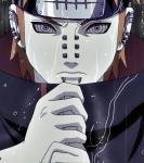
SkywardRiver Posted February 20, 2018 Share Posted February 20, 2018 I would say it looks good but: Maybe you didn't know when designing it, but it's "suspiciously" similar to the point where you would probably get players from Darkstory smack-talking your game if you used it. I don't know, just my thoughts. SolidLink, George and Refur 1 2 Link to comment Share on other sites More sharing options...
gallighanmaker Posted February 20, 2018 Author Share Posted February 20, 2018 @SkywardRiver I was thinking about it yesterday, when they showed me a photo just like you posted above, but I used this concept to make my own UI: My design is really similar to Dark Story, but still think the model with the circle is different and I not see any problems, I believe the concept of the project itself is different. My idea was to leave the hotkeys similar to wasd movements But I understand your point. @Blestro kk, thanks for the tips man, but I believe that I will upgrade UI with the circle. @Refur thank you for the feedback, your project is awesome, it is good to see you guys sharing ideas. @Capivarinha @Khaikaa Thanks guys, helped a lot in my ideas, keep your eyes on this, more will come. Thanks! SkywardRiver and Refur 2 Link to comment Share on other sites More sharing options...
jcsnider Posted February 20, 2018 Share Posted February 20, 2018 No one tell him that the hp and mp bars are hard coded to deplete towards the left o.O George 1 Link to comment Share on other sites More sharing options...
gallighanmaker Posted February 20, 2018 Author Share Posted February 20, 2018 @jcsnider it's just a concept, I wanted it to apply 100% in the engine but I'll wait for source to leave it that way. But is it possible to leave in current release in this format ?. Edit: I can make with two circles or something like that. Link to comment Share on other sites More sharing options...
drikorios Posted February 20, 2018 Share Posted February 20, 2018 Bem simples e clean, porém acho meio estranho a junção dos recursos com pixels visíveis com os recursos Kenney, meio que há um desencontro aí. Link to comment Share on other sites More sharing options...
gallighanmaker Posted February 20, 2018 Author Share Posted February 20, 2018 @drikorios in the future I'm going to change the hotkeys icons for a more visible design and not use kenny's but it fits well in the design I wanted. Link to comment Share on other sites More sharing options...
gallighanmaker Posted February 20, 2018 Author Share Posted February 20, 2018 Life and mana bar separated: Refur 1 Link to comment Share on other sites More sharing options...
SkywardRiver Posted February 21, 2018 Share Posted February 21, 2018 4 hours ago, gallighanmaker said: Life and mana bar separated: I would say it looks good, but: Maybe you didn't know when designing it, but it's "suspiciously" similar to the point where you would probably get players from Diablo smack-talking your game if you used it. I don't know, just my thoughts. (lol jokes. Looks good man) gallighanmaker 1 Link to comment Share on other sites More sharing options...
gallighanmaker Posted February 21, 2018 Author Share Posted February 21, 2018 holy shi**** no, again, no... @SkywardRiver Thanks man, I hope some day implement this in intersect, as jc said, part with calculates the bars is hardcoded so I will not be able to do it now, sad SkywardRiver 1 Link to comment Share on other sites More sharing options...
gallighanmaker Posted February 22, 2018 Author Share Posted February 22, 2018 In-game test: 1600x900 I know that the bars are hardcoded to deplete towards the left but I still managed to apply vital graphics in format I wanted. I add character portrait. Order of numbers was easier to leave like that, it was not what I wanted but it's still good for now. Exp bar is still missing. 1366x768: http://prntscr.com/ii2wrx What do they think for now ?. Refur 1 Link to comment Share on other sites More sharing options...
Giligis Posted February 22, 2018 Share Posted February 22, 2018 I think the latest one is actually the one I like the best. Good work man! Link to comment Share on other sites More sharing options...
gallighanmaker Posted February 22, 2018 Author Share Posted February 22, 2018 @Giligis I will update vitals with some effects on the texture and improve the edges. I need to change the ingame text font to have a better look and surely improvements will come. Thank you for your feedback. Link to comment Share on other sites More sharing options...
Giligis Posted February 22, 2018 Share Posted February 22, 2018 1 hour ago, gallighanmaker said: @Giligis I will update vitals with some effects on the texture and improve the edges. I need to change the ingame text font to have a better look and surely improvements will come. Thank you for your feedback. I agree, changing the text to fit the UI more would make a giant difference. Link to comment Share on other sites More sharing options...
Khaikaa Posted February 22, 2018 Share Posted February 22, 2018 is that UI working properly on the lowest resolution? Link to comment Share on other sites More sharing options...
gallighanmaker Posted February 22, 2018 Author Share Posted February 22, 2018 @Khaikaa Work on 16:9 aspect ratio resolutions: 1024×768, 1366×768, 1600×900, 1920×1080 Link to comment Share on other sites More sharing options...
gallighanmaker Posted February 23, 2018 Author Share Posted February 23, 2018 Update: Panels and custom font emptyaccount 1 Link to comment Share on other sites More sharing options...
Recommended Posts
Create an account or sign in to comment
You need to be a member in order to leave a comment
Create an account
Sign up for a new account in our community. It's easy!
Register a new accountSign in
Already have an account? Sign in here.
Sign In Now