Xeno Posted February 18, 2019 Posted February 18, 2019 Welcome to a 10 part series Art Tutorial, where I will be demonstrating methods to help with pixel art, vector art and art in general. These tutorials are applicable with most mediums unless specified.Part 1 ~ Hue Shifting Today I'm going to demonstrate how to select a range of hues for your pixel art. Known as "hue shifting" the method I will demonstrate can help bring life to your artwork. Here's an example of pixel art without hue shifting, using 3 colors: In this scenario I simply chose blue on the color spectrum, and went from dark to light for a shadow, midtone & highlight color: Now here's an example of the same pixel art with the hue shifting method (used by professional artists): If you compare the two you'll notice the second has way more character, but also realism. And that's because in real life shadows and highlights are rarely ever the same color. In this example we used a range of blue hues going from navy blue (almost purple) to an aqua color: So the question is, how do we know which colors to choose. As a general rule of thumb shadows are generally cooler and light is generally warmer. Blue is the coolest color, yellow is the warmest. Here is an example of color ramps that someone already created for bushes to demonstrate: Sometimes even extreme hue shifting can look good as seen in this example: Because it's night time in this scene, naturally there is a lot of dark shadows (purple/blue/dark green) and the bright fire brings highlights to the surrounding area in an orange/yellow hue. To summarize. Hue shifting brings ambience and life to pixel art. Usually you want to choose cooler colors for shadows (bluish,greenish,purplish) and warmer colors for midtones/highlights (reddish,orangish,pinkish,yellowish). Of course, this all depends on the setting. It just happens that sunlight and campfires give off yellow tinged light. If this scene was indoors with a red light on, the highlights would be more red. I hope this helps someone in making pixel art. If you have any questions or want to know more let me know.Part 2 ~ Color Selection Spoiler Part 2: Color Selection In the last tutorial we discussed Hue Shifting. Today we will be talking about Color Selection. In my opinion choosing the right colors can be life and death, as to whether or not your art looks good or not. Choosing the wrong ones can make your piece look washed out, potentially too dark, or just ugly in general. Along those lines Id like to share a piece that I recolored after a huge palette re-vision for Nightmare. The first is before, the latter is after palette revision: So here's the thing. The first uses hue shifting that we discussed in part 1. That's not the issue. In fact, in some ways the first is more realistic because the colors aren't as saturated. (Depending on the style of your game you may fluctuate between realism and abstractism, or cartoony feels). But there are a few issues with color selection in the first. One being that there is a lack of contrast between colors. This lack of contrast also makes the piece look like its shrouded in fog (Which would be okay if it actually were). For shadows to be this light, the piece would need to be under heavy light, as well. But the highlights and midtones dont make that apparent. However, in the second the shadows are darker and cooler, owing to more realistic lighting (despite the semi-unrealistic color choices). The midtones and highlights also pop in a way that you know the light is hitting right. That's partly due to the darker shadows, as they create more contrast in the piece. To summarize, it is not just a matter of hue shifting that wil determine good color choice. You have to also be aware of the environment in which the piece is in (Is it daylight, is it nighttime, is there fog?), as well as the intensity of light. If there isn't enough contrast between shades (either done through hue shifting or simply brightening/darkening), the piece will look washed out and also not pop. And lastly, how saturated you want colors to be will depend on whether you want more cartoony feel (more saturated) or more realistic feel (less saturated). That's all up to you. In the next tutorial I will be discussing line art. Agoraphobic, Beefy Kasplant, pLeet and 4 others 6 1
Ainz Ooal Gown Posted February 19, 2019 Posted February 19, 2019 Very cool, thanks for sharing Xeno 1
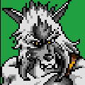
Xeno Posted February 22, 2019 Author Posted February 22, 2019 Part 2: Color Selection In the last tutorial we discussed Hue Shifting. Today we will be talking about Color Selection. In my opinion choosing the right colors can be life and death, as to whether or not your art looks good. Choosing the wrong ones can make your piece look washed out, potentially too dark, or just ugly in general. Along those lines Id like to share a piece that I recolored after a huge palette re-vision for Nightmare. The first is before, the latter is after palette revision: So here's the thing. The first uses hue shifting that we discussed in part 1. That's not the issue. In fact, in some ways the first is more realistic because the colors aren't as saturated. (Depending on the style of your game you may fluctuate between realism and abstractism, or cartoony feels). But there are a few issues with color selection in the first. One being that the hues simply weren't shifted enough, thus there is a lack of contrast. This lack of contrast also makes the piece look like its shrouded in fog (Which would be okay if it actually were). For shadows to be this light, the piece would need to be under heavy light, as well. But the highlights and midtones dont make that apparent. However, in the second the shadows are darker and cooler, owing to more realistic lighting (despite the semi-unrealistic color choices). The midtones and highlights also pop in a way that you know the light is hitting right. That's partly due to the darker shadows, as they create more contrast in the piece; but also because of deeper hue shifting. Hue shifting alone will not get the best color choices. You also have to be aware of the environment which the piece is in (Is it daylight, is it nighttime, is there fog?), as well as the intensity of light. If there isn't enough contrast between shades (through a combination of hue shifting and brightness change), the piece will look washed out and also not pop. And lastly, how saturated you want colors to be will depend on whether you want more cartoony feel (more saturated) or more realistic feel (less saturated). That's all up to you. In the next tutorial I will be discussing line art.
Eternic Posted March 12, 2021 Posted March 12, 2021 Great guides for an absolute beginner like me! I hope to see more of those in the future.
Recommended Posts
Create an account or sign in to comment
You need to be a member in order to leave a comment
Create an account
Sign up for a new account in our community. It's easy!
Register a new accountSign in
Already have an account? Sign in here.
Sign In Now