
Cocolharicot
-
Posts
34 -
Joined
-
Last visited
Recent Profile Visitors


Cocolharicot's Achievements
Single Status Update
See all updates by Cocolharicot
-
New logo !
-

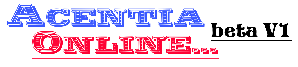
i wouldn't use that font for beta V1. also i don't think your title needs a "..." after it.
-

-
It's just recomendations, there are design concepts on using fonts and what people typically think are ugly fonts. The fonts that people hate are basically the ones that "aren't complex and are fun and not boring" it tends to display lack of design. http://mashable.com/2012/10/03/comic-sans-history/#3DP36GJRUEqc
Mashable, Smashing Magezine, and Design Bomb are great blogs for learning more about design concepts and designing better graphics. If you ever have the oppurtunity to take a commercial arts class, i recommend doing it. They focus more on modern digital design with adobe photoshop. illustrator, and in design.
The font you selected for beta V1 is a lot like comic sans and displays lack of creative design.
Resource for you:
-