
Cocolharicot
-
Posts
34 -
Joined
-
Last visited
Content Type
Profiles
Forums
Downloads
Everything posted by Cocolharicot
-
Hello, after doing my first paperdolls, that's what gives in games ^ _ ^ How to avoid this?

-
no problem
-
Hello, I would like to know if it will be possible to have an updater for my server. Because we have added a lot of article on the project but the fact of always giving the additions poses us problem. I'm not asking for a beautiful and powerful updater, but something that saved my life. I am not at all a pro in this area of updater creation. Thank you in advance for the help that will be given to me. PS: Already tested Gem Launcher + Game Patcher But the trouble and that it downloads the additions in duplicate or it does the half of the updates, or not see at all. Good day to all
-
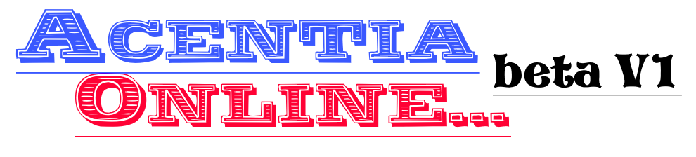
New logo !
-
i wouldn't use that font for beta V1. also i don't think your title needs a "..." after it.
-

-
It's just recomendations, there are design concepts on using fonts and what people typically think are ugly fonts. The fonts that people hate are basically the ones that "aren't complex and are fun and not boring" it tends to display lack of design. http://mashable.com/2012/10/03/comic-sans-history/#3DP36GJRUEqc
Mashable, Smashing Magezine, and Design Bomb are great blogs for learning more about design concepts and designing better graphics. If you ever have the oppurtunity to take a commercial arts class, i recommend doing it. They focus more on modern digital design with adobe photoshop. illustrator, and in design.
The font you selected for beta V1 is a lot like comic sans and displays lack of creative design.
Resource for you:
-
-
Source 0.0.8 ?
-
Problem solved, If it can help many people who do not want to go through a common event. Here's the trick: @> Change Player Items [Take: Item ITEM TEST] : Item(s) Given/Taken Successfully @> Show Text: Bonjour j'échange 1 level contre.. @> Level Up Player : Item(s) Given/Taken (Doesn't have/Inventory full) @> Show Text: Désolé tu ne posséde pas de ticket.. @> : End Item Change @>
-
Bonjour. J'écris ce sujet parce que je veux créer un évent avec l'utilisation d'un objets nommé LEVEL_UP. Sauf que rien ne se passe. Serait-il possible d'avoir de l'aide à ce sujet? Bonne journée à tous English: Hello. I am writing this topic because I want to create a vent with the use of an item named LEVEL_UP. Except that nothing happens. Would it be possible to get help on this? Good day to all
-
Hi, Intersect is open source ?
bye
-